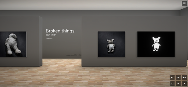
This is my review of ArtPlacer – the Virtual exhibition site. I looked at its main competitor Kunstmatrix. And this is why I chose ArtPlacer.
The ArtPlacer site is very easy to navigate. It has sections for setting up Virtual exhibitions, an Artworks page where your artworks are searchable even when you haven’t placed them in an exhibition (if you want them to be) and they have Library spaces where you or your buyers can visualise your art on a wall.
It is really simple to upload and use images of your work – and it has a much higher MB for each image compared to Kunstmatrix.
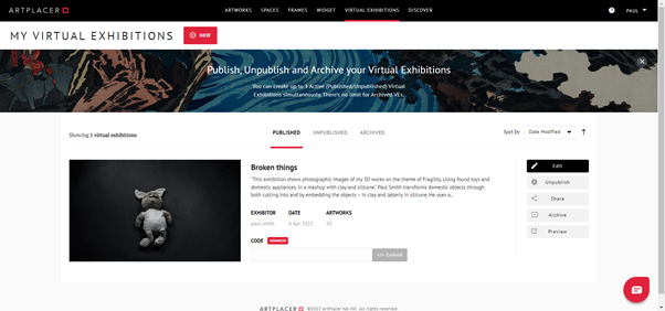
It’s really easy to add your paintings or photo images to the virtual gallery walls. And you can move them easily up/down or across left/right and add picture frames.
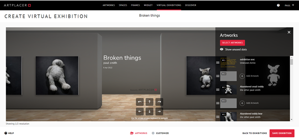
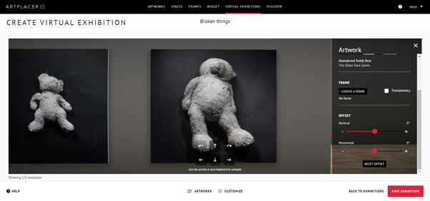
What I really like about ArtPlacer’s gallery compared to Kunstmatrix is the Navigation – for both you when designing the exhibition and for your visitors. It has 2 extra buttons compared the 4 of Kunstmatrix so it is very easy to turn when you’re “walking round” the gallery space. With Kunstmatrix if you go close to a picture then sweep round it stays nose up to the wall which isn’t great whereas ArtPlacer smoothly zooms out so you can see the gallery space and the other pictures much better.

The only thing missing from artplacer’s virtual gallery setup when I used it was the ability to add Sculptures and other 3D works. Kunstmatrix does offer this but to be honest it looks poor. Artplacer have told me they have now added the facility to add 3D works to a virtual gallery although I haven’t tried this yet. I’ve had look at their 3D sculpture gallery demo and I don’t think it works that well yet as there are no shadows from the sculptures and they look artificial to me. But it’s a start and they should improve this in the future. See the artplacer sculpture gallery demo and more details on this link.

You get a choice of 2 galleries on the Basic Plan – one is a medium gallery space and the other is an artfair style booth. I used the medium gallery. While it would be nice to have a wider choice of gallery space, you can customise the walls and ceiling to any colour and there is a choice of 10 different floors. There are more galleries to choose from if you subscribe to one of the more premium plans.
There are loads of library spaces – which are walls from galleries, homes and other settings – that you can use to visualise how your art will look on a wall. You can also add your own gallery or room to use instead. These are the ones I chose – all from Artplacer’s library.
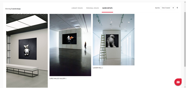
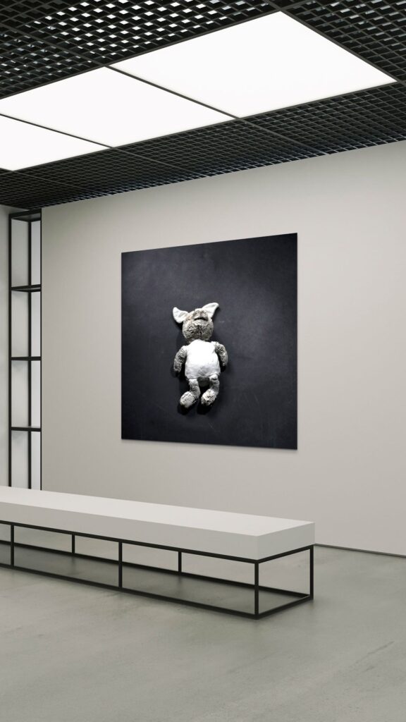
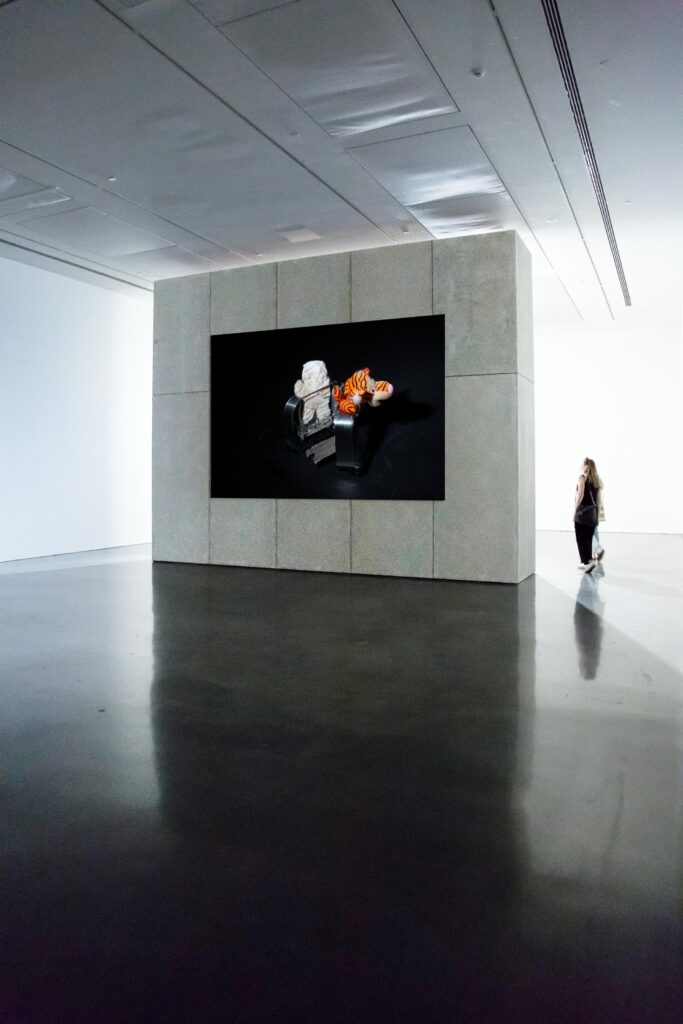
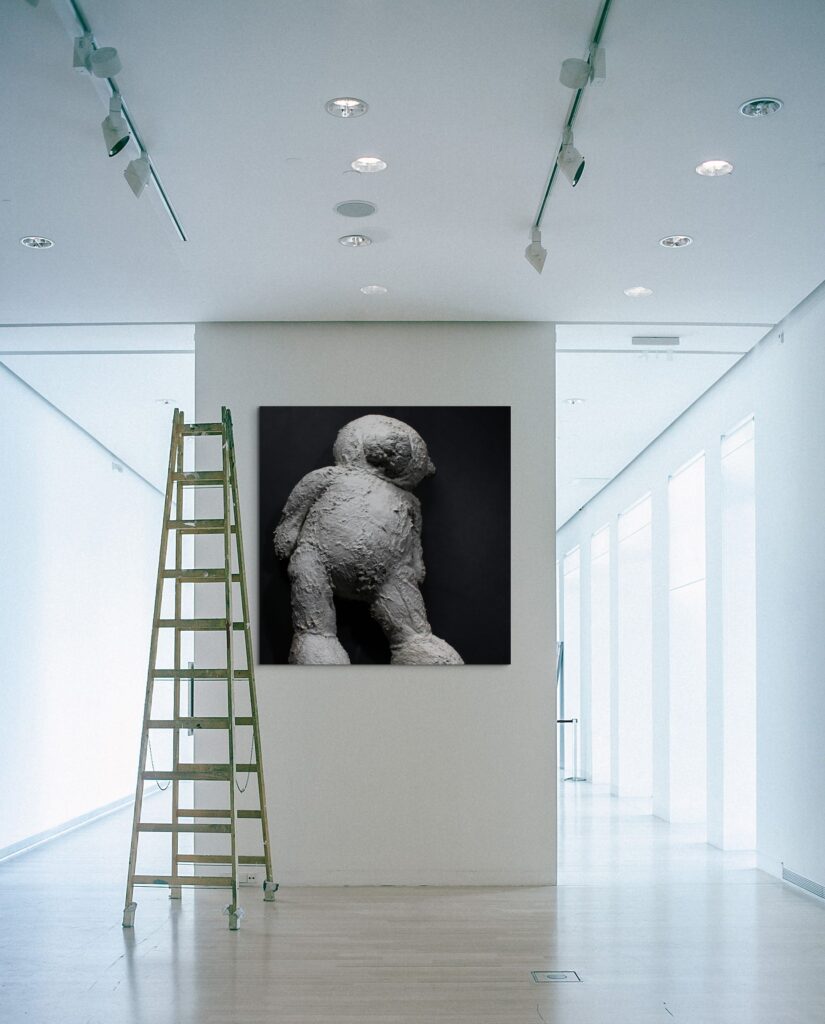
They also have an app which lets you see any artwork from ArtPlacer on your own wall. As you can probably tell, I’m really happy with ArtPlacer. it’s a lot more user friendly than Kunstmatrix – both to set up your gallery and for visitors to navigate.


